| Bar Graph |
|---|
|
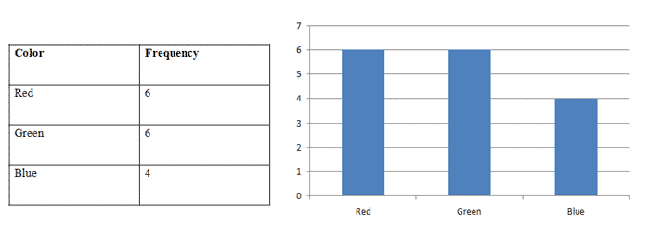
A bar graph lists each category on the horizontal axis and the number of occurrences for each category on the vertical axis. |
Imagine that you reached into a bag of candy 16 times and pulled out the following colors of candy:
Red, Green, Green, Green, Blue, Blue, Red, Blue, Green, Green, Red, Red, Blue, Green, Red, Red
How could we display this information as a bar graph? First, create a frequency table. Then, use that information to create the bar graph.
|
Figure 1. |
|---|
In a bar graph, the bars don't touch. If the bars touched, this would be a histogram.
| Pie Chart |
|---|
|
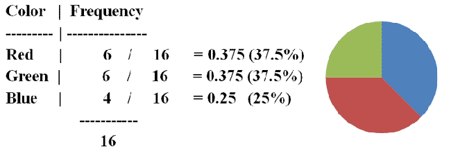
A pie chart is a circle divided into sectors, where each sector represents a category of data that is proportional to the total amount of data collected. |
| Proportion |
|---|
|
A proportion is a part considered in relation to its whole. |
For example, imagine a pizza with 8 slices. Your friend takes and eats 3 slices. In this case, 3/8 is the proportion of the pizza your friend took. This can also be represented as a decimal. 3 / 8 = 0.375
Use the information from the "bag of candy" example to contruct a pie chart for the three different colors.
|
Figure 2. |
|---|


 Facebook
 YouTube


 Home
Home
 Calculators
 Tutoring